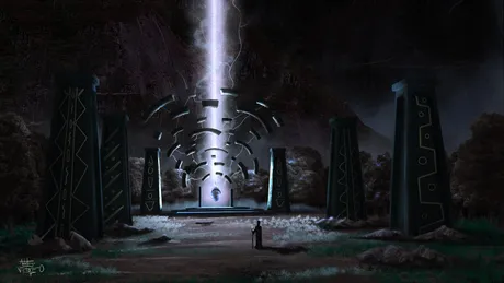
 Hello there beautiful people and welcome to another blog,
for today ill be showing you guys a concept art i did for a game, but guess what it wasn't used for the final production, i had to redo new ones cause the idea they had changed, (sigh)... some clients are just!...(sigh)
ill be giving guys a little tutorial on hw i came about the final image and it was quick, because i used both 3d and photo bashing method,
Here's the process:
for the first process, i created simple, 3d structures in blender, as layout, a lot of artist think 3d is meant to be for the final product, but na 3d can be used to either create the perspective, or the lay out, of any art project, cause its easy to get perspective in blender 3d since it has grid in built already
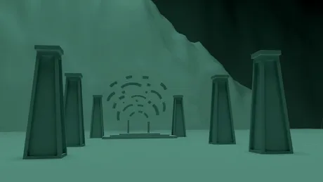
later i then took it into clip studio, where i manually separate all objects, i forgot to render separately in blender
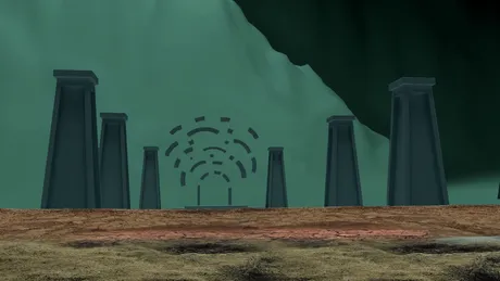
then i added some, ground textures i got from online or anywhere actually , as long as it looks like the ground you're good to go, together i grabbed some rocks i also got from online
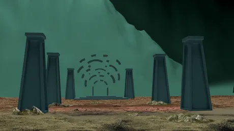
later i went on to also grab some transparent i got from a website online , i cant really remember the site, but you can visit some free websites that offers, free everyday objects png, there are a lot of them online
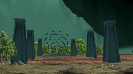
with that done i duplicated the trees to create this forest surrounding
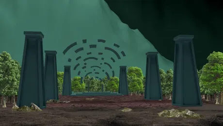
for the mountain i used the same method for the tree to get the mountain also, but what i did was to duplicate the texture to create this feeling of fullness
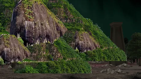
and then i gave them some random , arrangements, to simulate a mountain
Tip 1: when arranging natural elements, either for arrangements, or texture purpose like this mountain, its good to make the arrangement random, so to not get that, artificial look, cause nature doesn't really care about arrangements, randomness, is a good way to portray natures elements, just like trees, if you wanna create the leaves on a tree you don't paint them in straight lines you paint them randomly
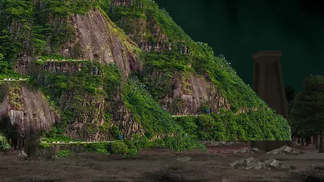
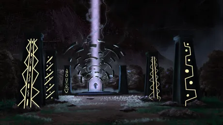
since i was going for a dark look, i darkened the objects in the scene, cause , yeah that was what i was going for, the concept is a dark spiritual Yoruba land
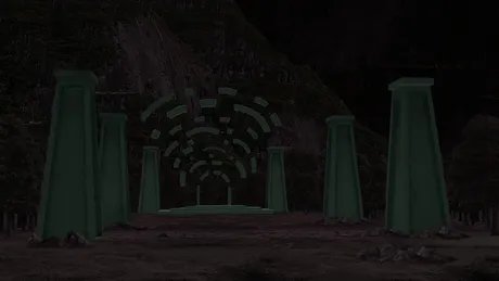
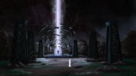
so while creating, the image, i decided to create a main light source, and i though to myself since this is a fantasy, why don't i add some lighting to the main objects is the center doorway, The idea about the scattered objects at the center is that, its some sort of doorway to another realm, and then the main doorway, due to too much energy emitting from the main Ife sculpture as scattered, but then that same energy is keeping the scattered door way objects together, instead of them scattered around
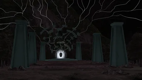
i then added some lights to the thunder strike,
tip 2: quick way to make something glow in clip studio, duplicate the object you wanna add glow to , add a Gaussian blur to that duplicated object, by going to filter-then blur- and then gaussian blur, set that duplicated layer to add glow or add, and you'll definitely see it glow, if the glow is too much you can bring the layer opacity down
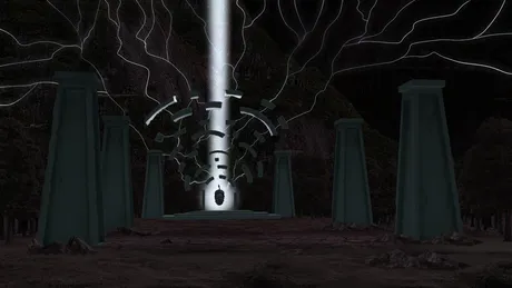

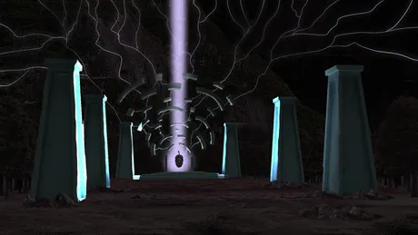
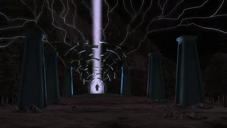
for the foreground, since there's gonna be light coming from the ife sculpture, and all, i added some lights using the color doge actually, but overlay can also work, cause
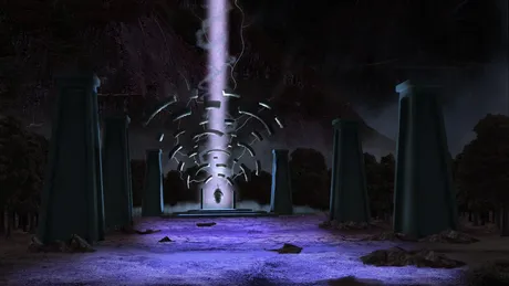
then i reduced the light a little to give it this fading effect, making the light closer to the main reference stronger,
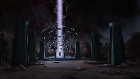
next i added the emittng light casting to the trees behind and surroundings
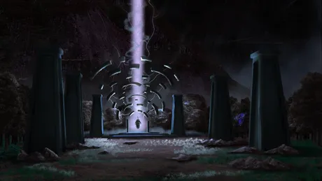
for the designs on the stones, i seriously don't know where my head got all those designs from, well i guess because of too much of Africa content are in my head, i guess, well the African designs were got from my memory, you can get yours from online if you do not know any.

That will be all for now, guys, hope you've learnt, even if you didn't, well hope you enjoyed it,...no seriously i hope you enjoyed it,
reason why i used 3d was because i didn't want to do the stress of getting a straight line perspective and all that for the pillars and guess what, it did increase, my time cause i did this under 40 minutes
THANKS SO MUCH FOR STOPPING BY,
and ill see you in the next one.
Return from 2d and 3d photo bashing concept art (with a little tutorial and tips) to victoradebiyiart's Web3 Blog

